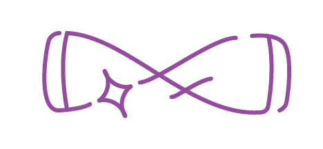
Logo Design
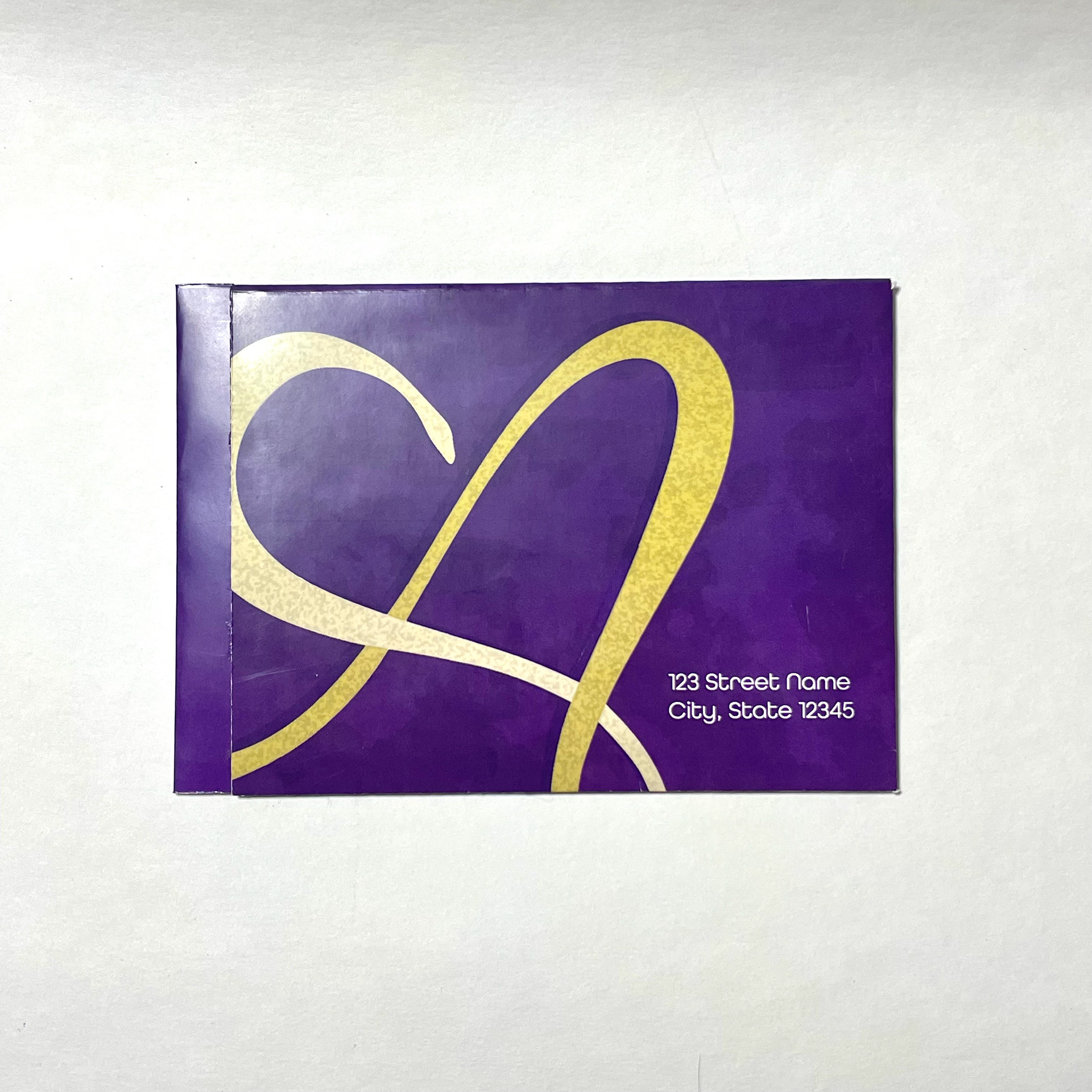
My keywords are elegant and self-confident, and I wanted my logo to subvert the expectations of an arsenic logo (murder and poison). I maintained a heart motif because I think self-love is a kind of self-confidence.

Package Design
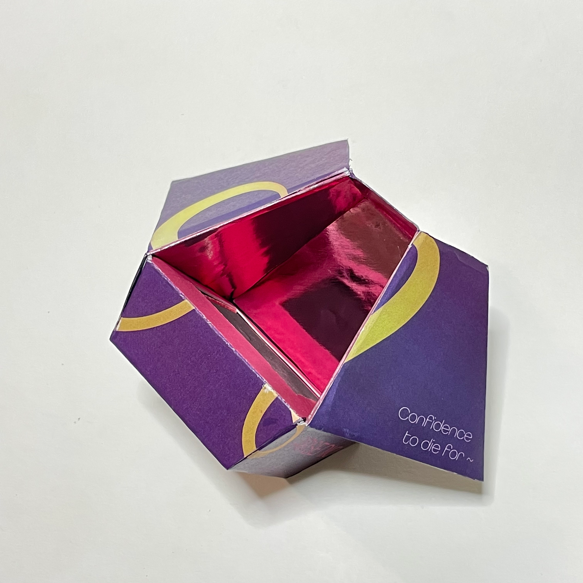
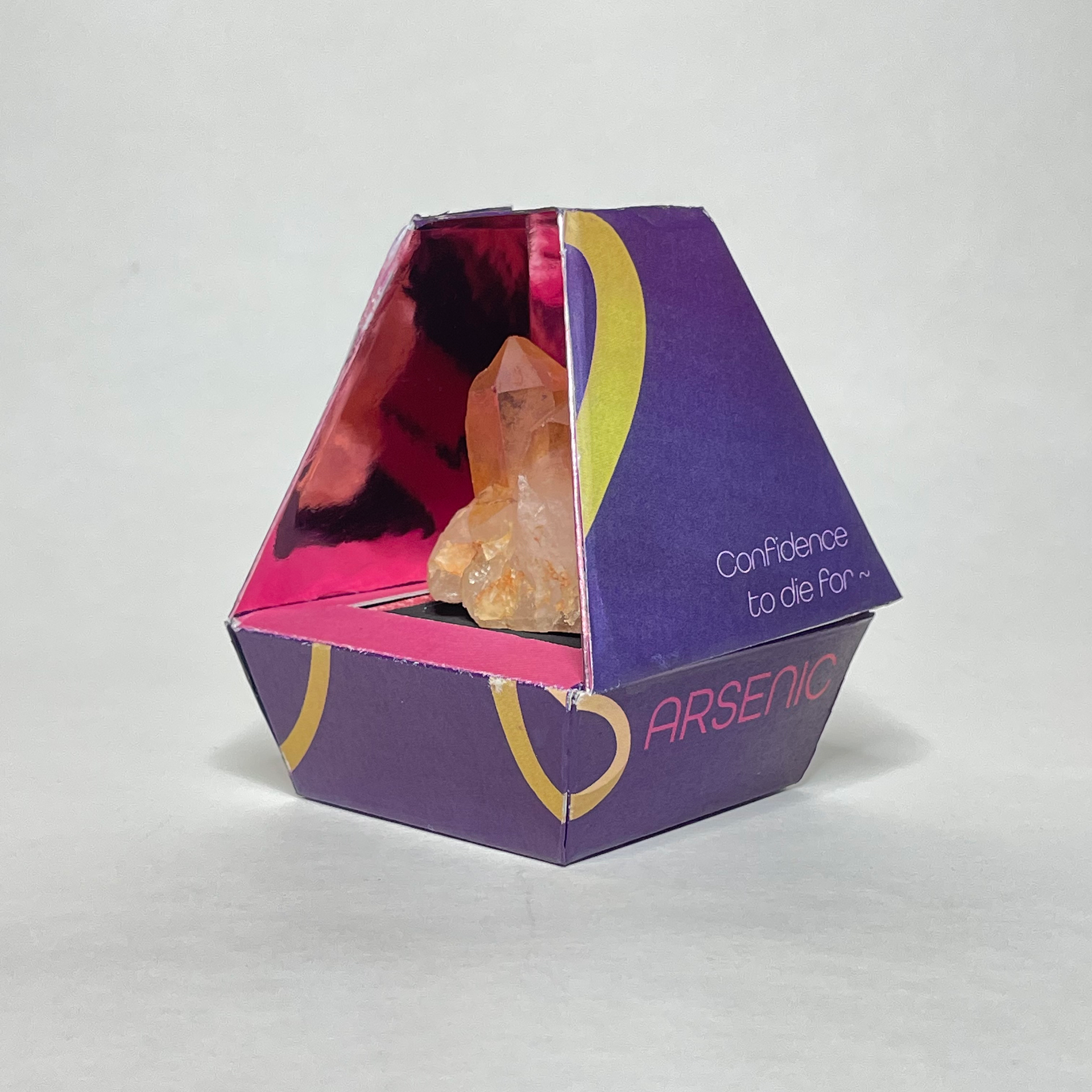
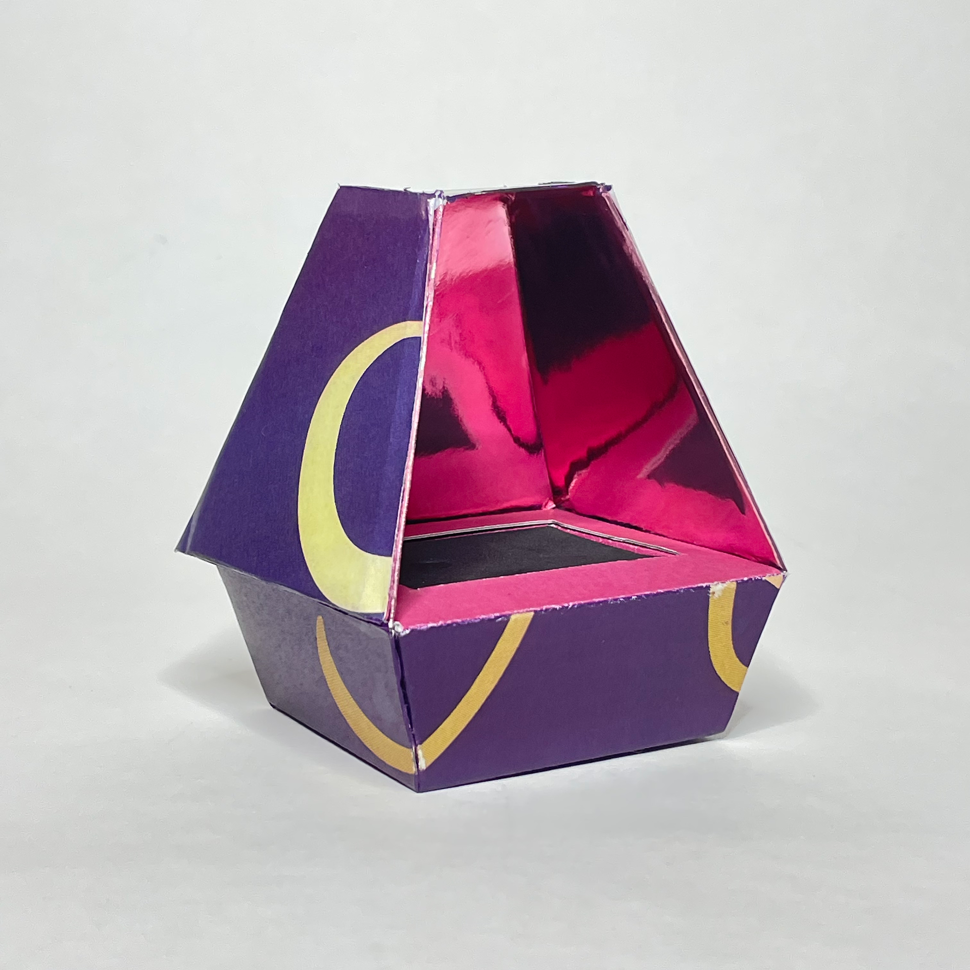
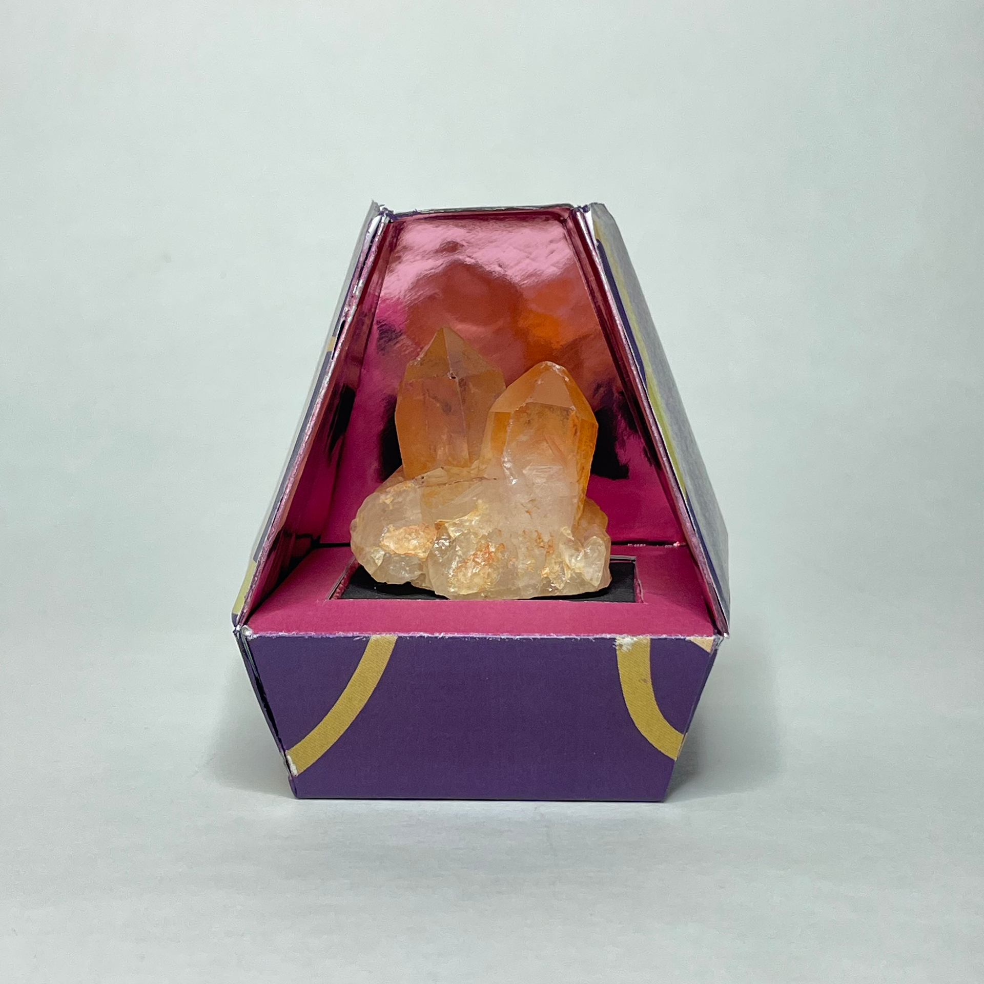
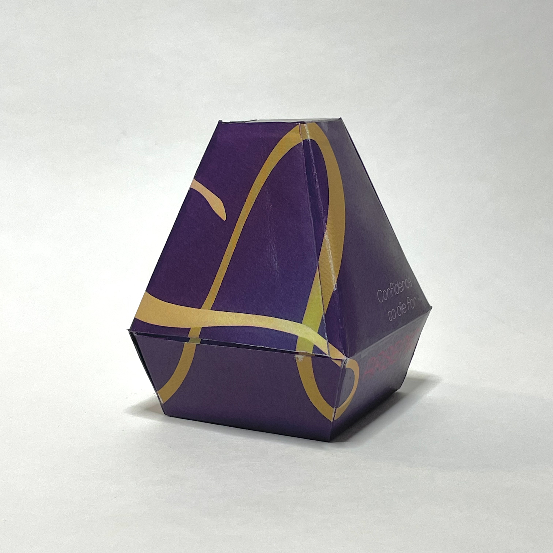
The flaps of the box have magnets in them, so they can hold to the sides and the package can also be used as a display box. The inside is pink heat-transfer vinyl.
Advertising Campaign
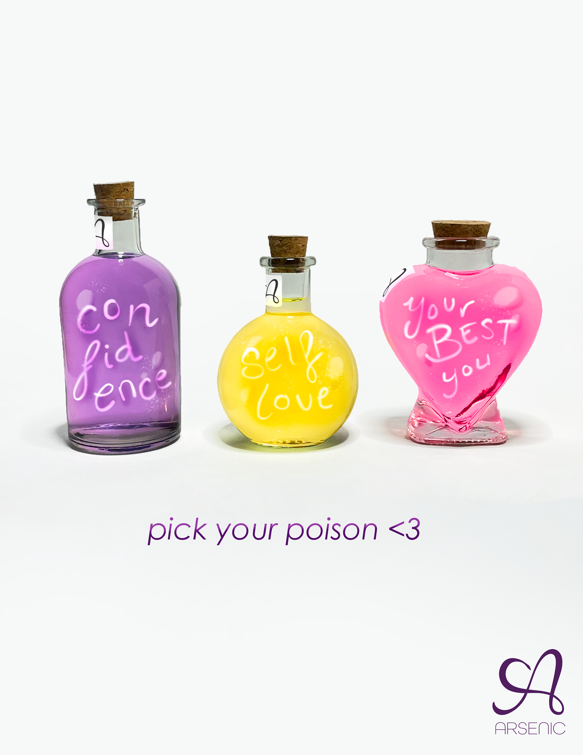
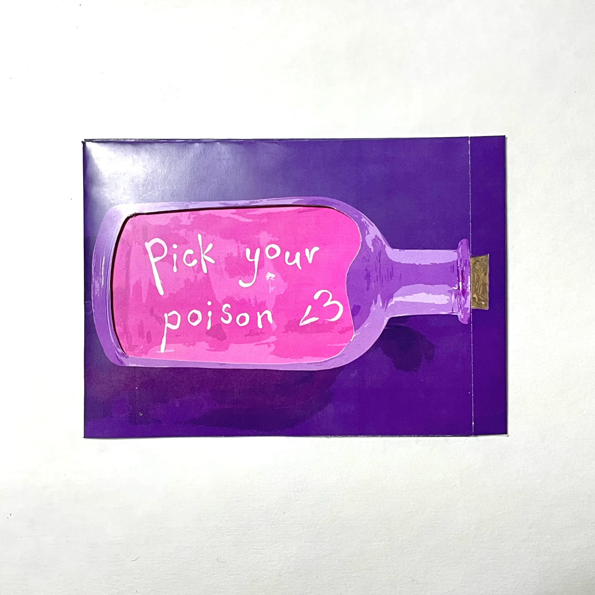
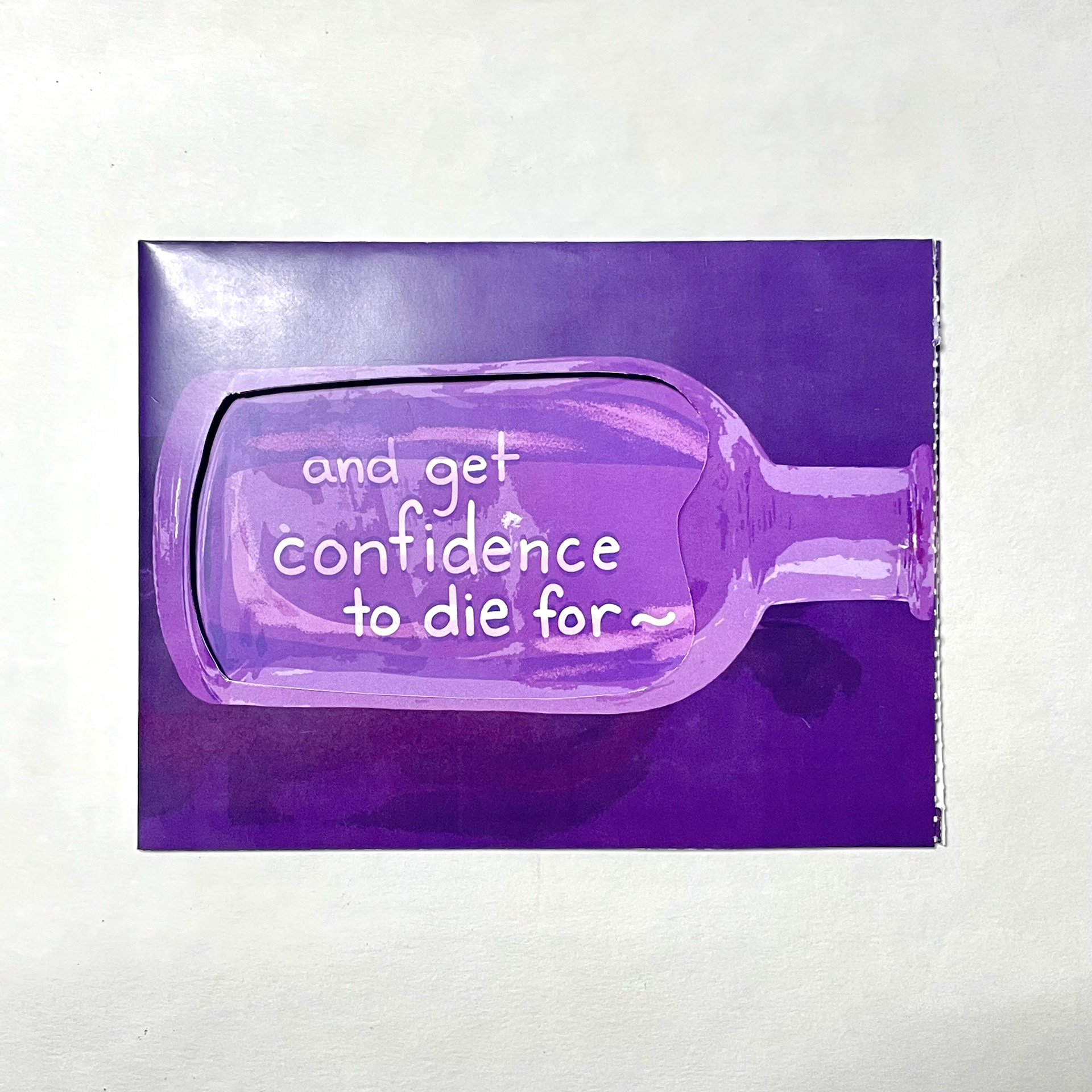
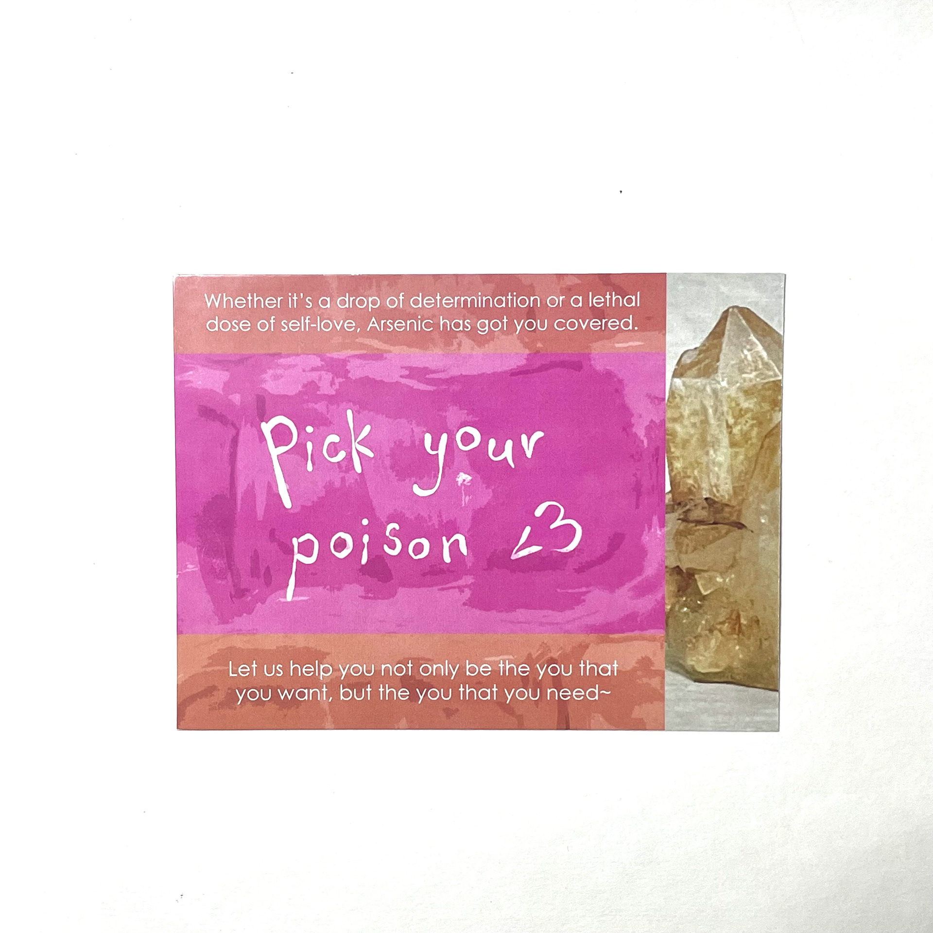
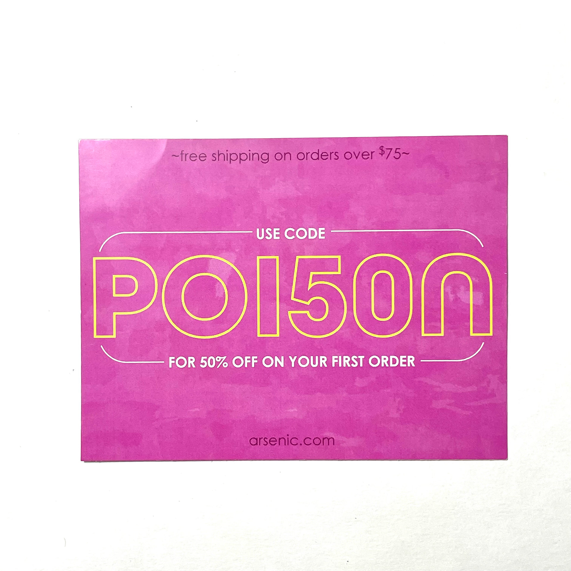
The brand is meant to be personal and places emphasis on its user, therefore the advertising elements are intended to maximize user interaction.
For the mailer, the recipient has to physically "open" the bottle to pick their poison.
In terms of environmental advertising, something as far away as a billboard doesn't serve the brand's purpose. A translucent roadside/pavement billboard is at user level so they can literally get up-close and personal with it. The interaction has another level to it by having the board itself be a photo opportunity, giving it the opportunity to spread on social media.
Print Ad
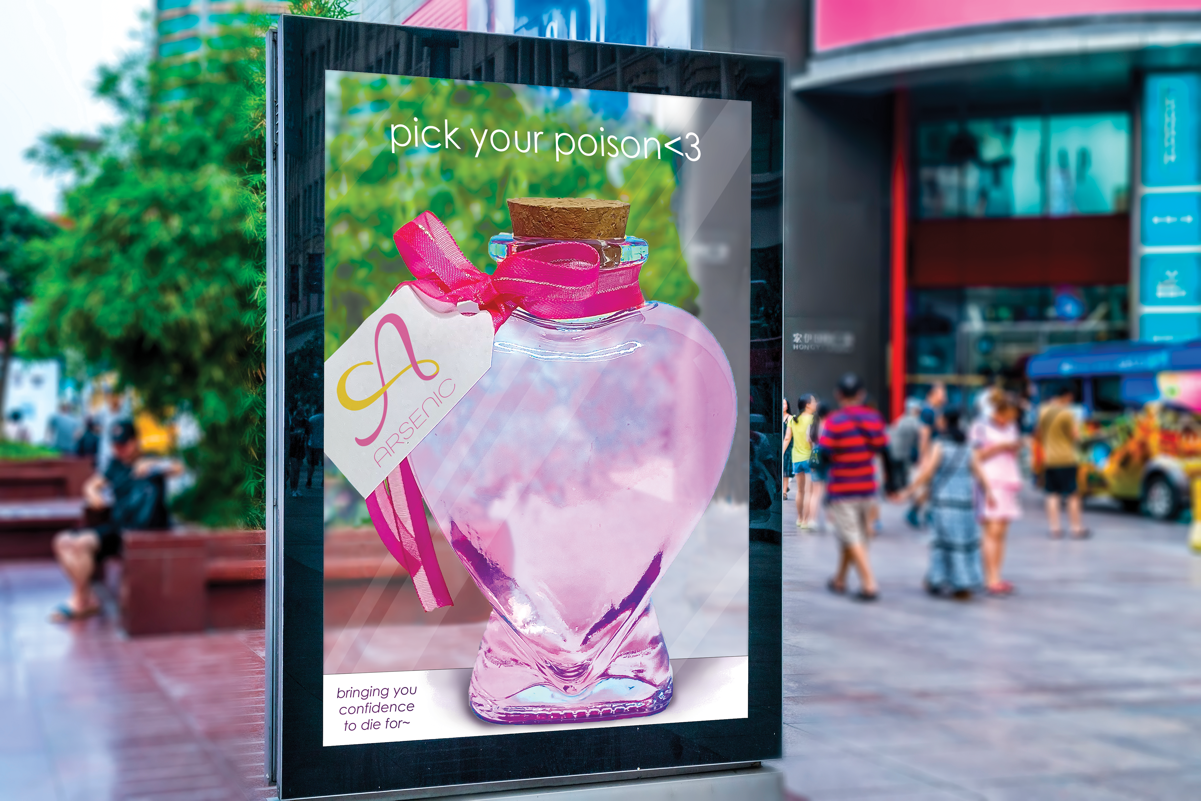
Environmental Ad
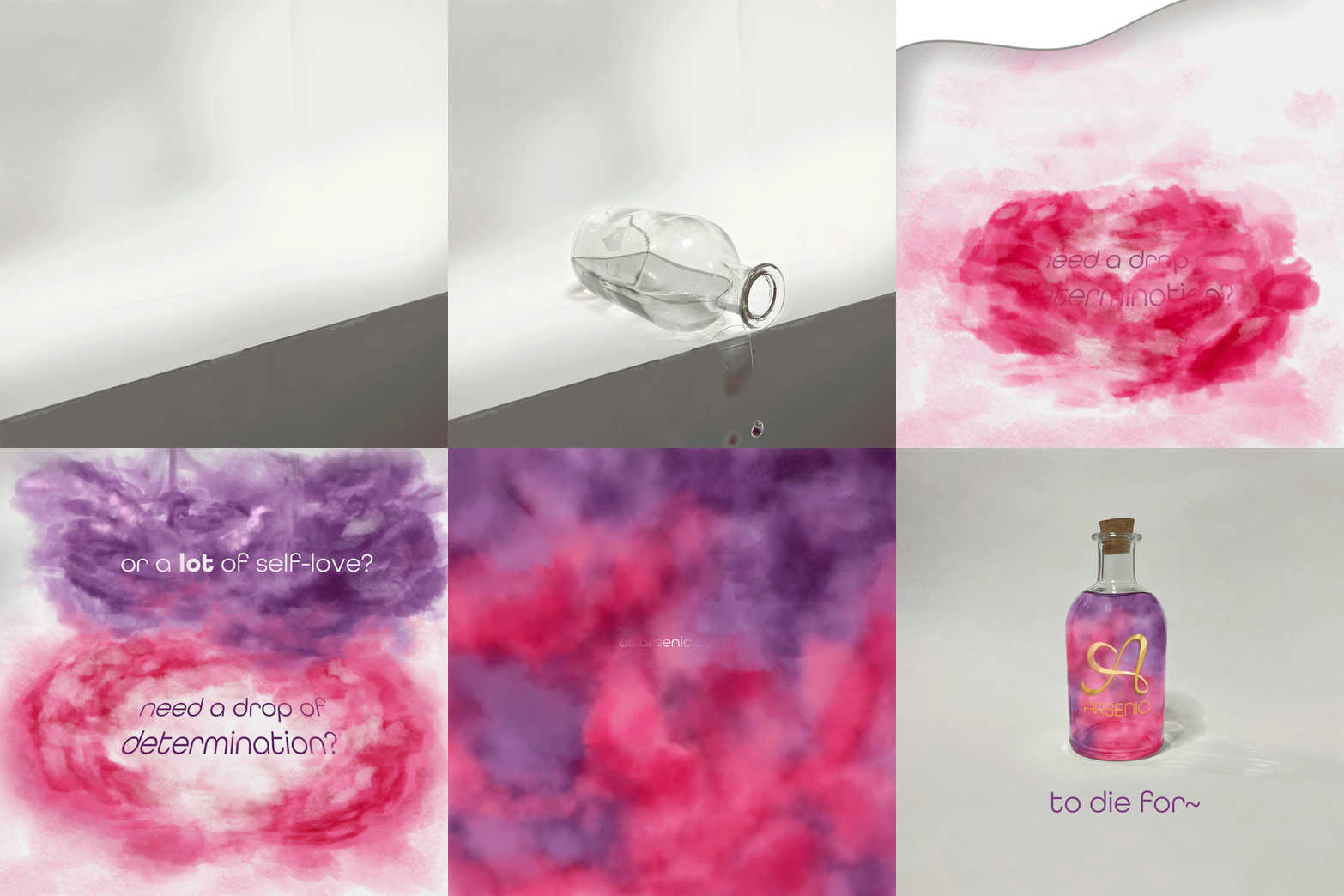
Brand Animation
Reiterating the tagline from the advertising campaign and still utilizing the bottle motif, the progression of the animation is guided by the flowing movement of ink to create a visually interesting and on-brand motion graphic.
Illustrated in Clip Studio Paint and animated in Adobe Photoshop. Photographs are my own.